
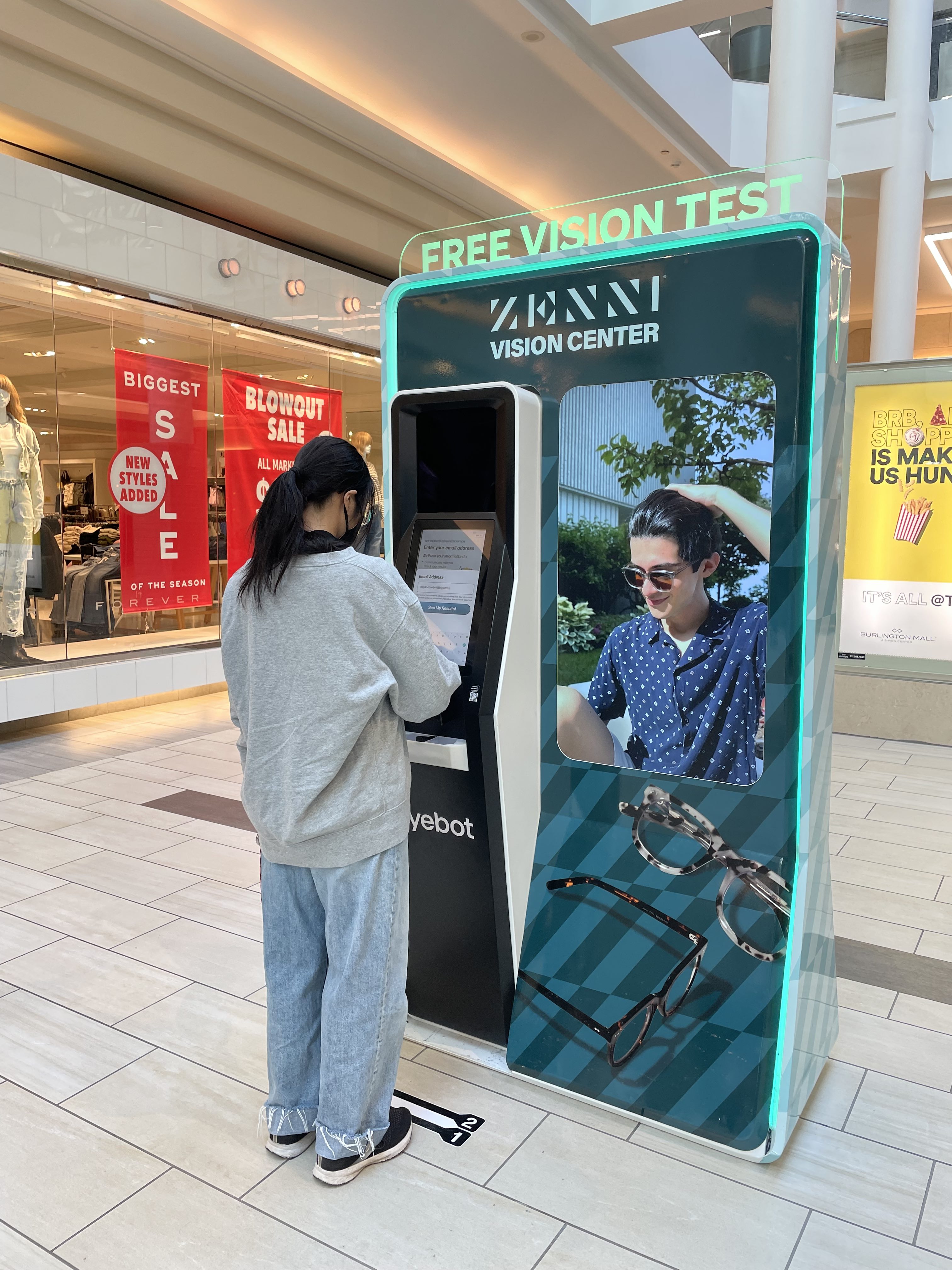
Eyebot is pioneering the vision care health space through their kiosk for people to test their prescription without the costly and time-consuming process of visiting an optometrist office. Their kiosk consists of three main components: a touch screen the user interacts with, a tray for placing glasses to be scanned, and an upper screen the user only looks at to scan their eyes. We prototyped improvements to the kiosk through light design segmented around the three interaction areas and sound cues linked to specific steps in the eye scanning process. By supplementing the experience with multimodal communication, those needing extra support (such as individuals with low vision after taking glasses off) were guided through the process, reducing confusion and leading to higher completion of kiosk flow.
People struggled to complete their vision screening on the kiosk because the workflow is different from traditional eye doctor guidance, or completely new to users. Our goal approaching the kiosk design was to create a more intuitive instructional experience while facilitating trust in the machine.
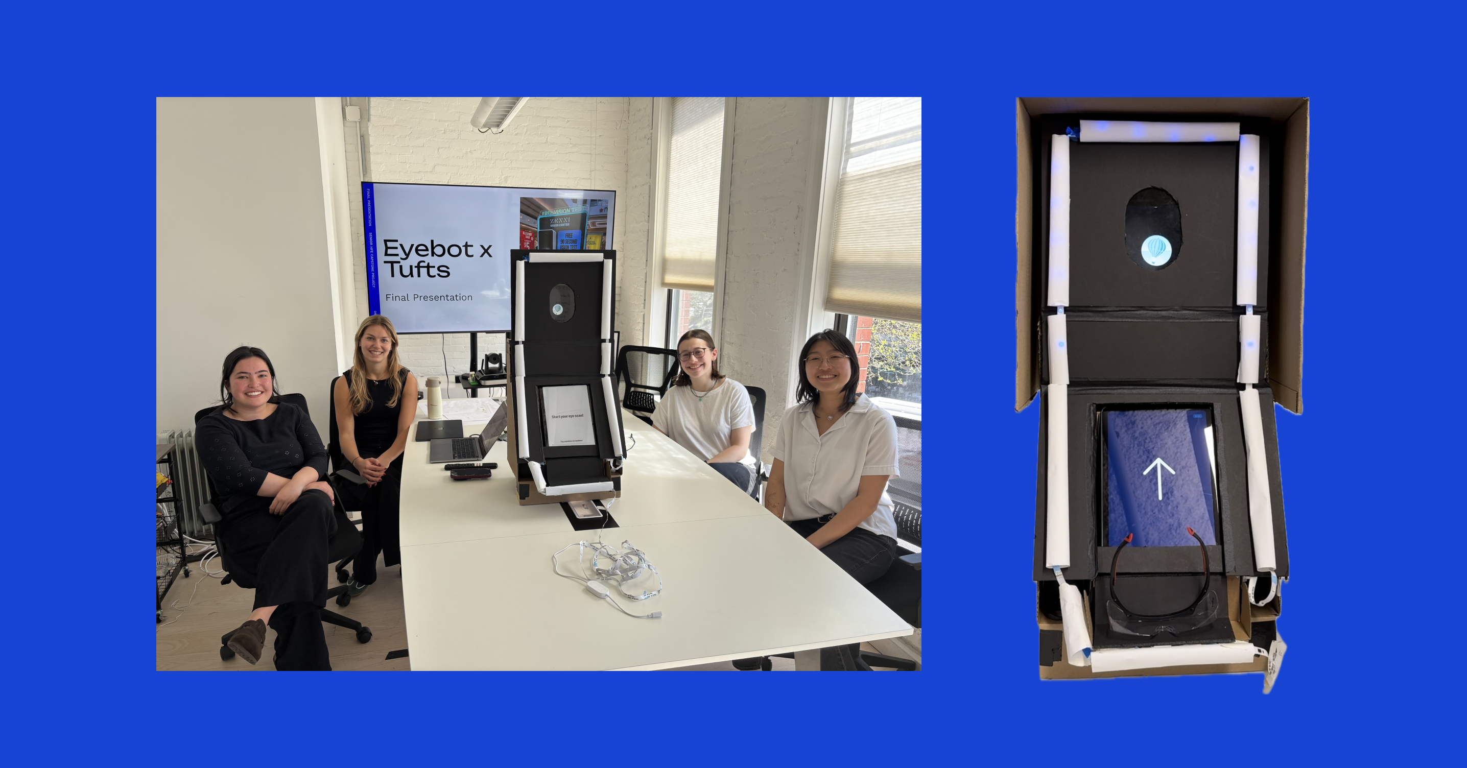
As a capstone project, this allowed us to synthesize and demonstrate our team’s collective learning throughout the human factors/engineering psychology program at Tufts.
After understanding the problem, we focused on supporting users through non-invasive, multimodal guidance (light and sound).
To get to the root of the problem, we tested the process ourselves, developing a corresponding task analysis. We further contextualized with background research of health kiosk design and competitor products. We deepened our knowledge through interviews with members of Eyebot’s target audience, those looking for vision care, to gauge general familiarity with eye exams and desires in a vision screening kiosk.
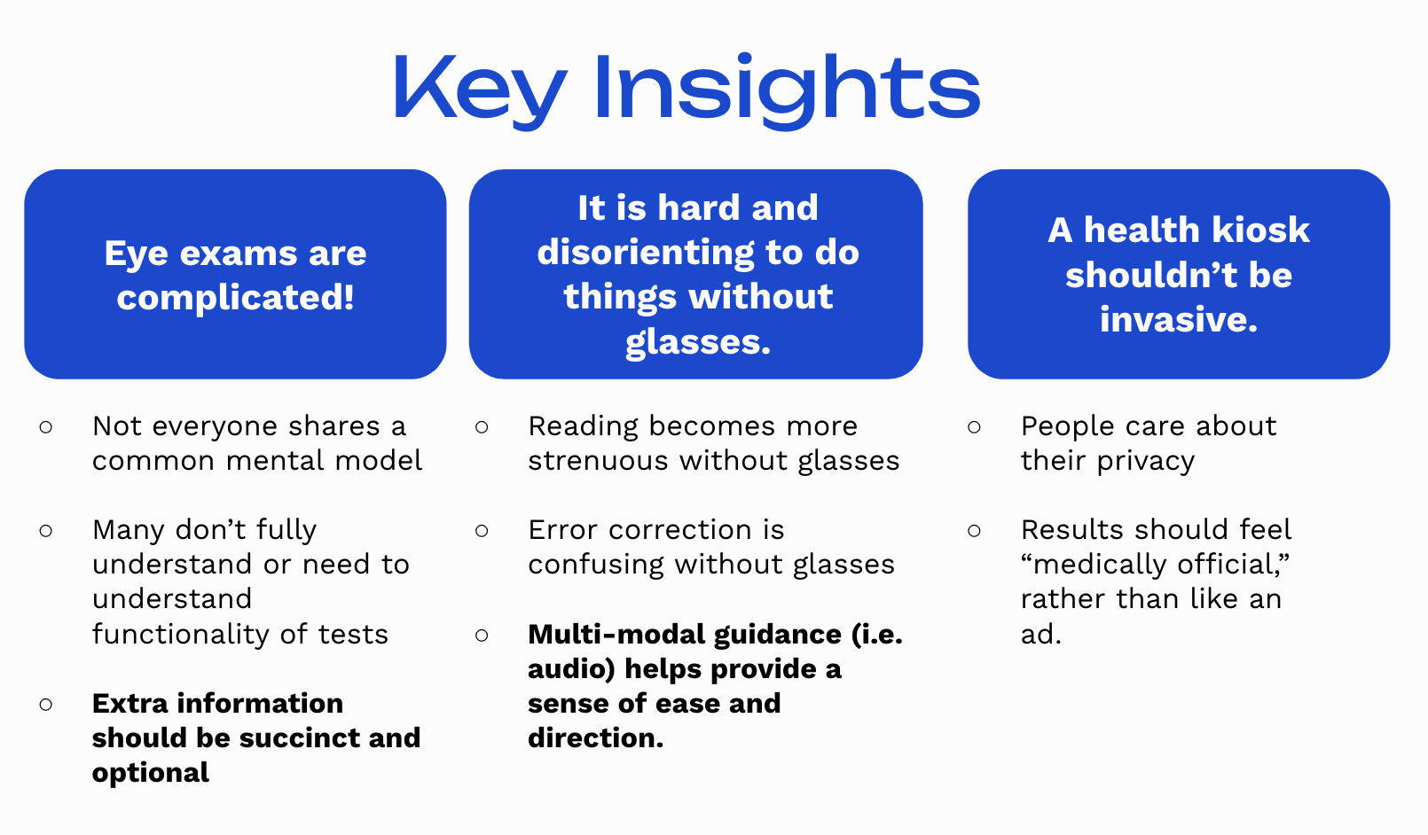
From our initial research, we distilled the complexity of eye exams, the disorientation people feel without glasses, and need for privacy from a kiosk.
Building off our insights, we revisited our initial task analysis to identify areas for improvement, and began prototyping ways to add light and sound guidance to the flow.

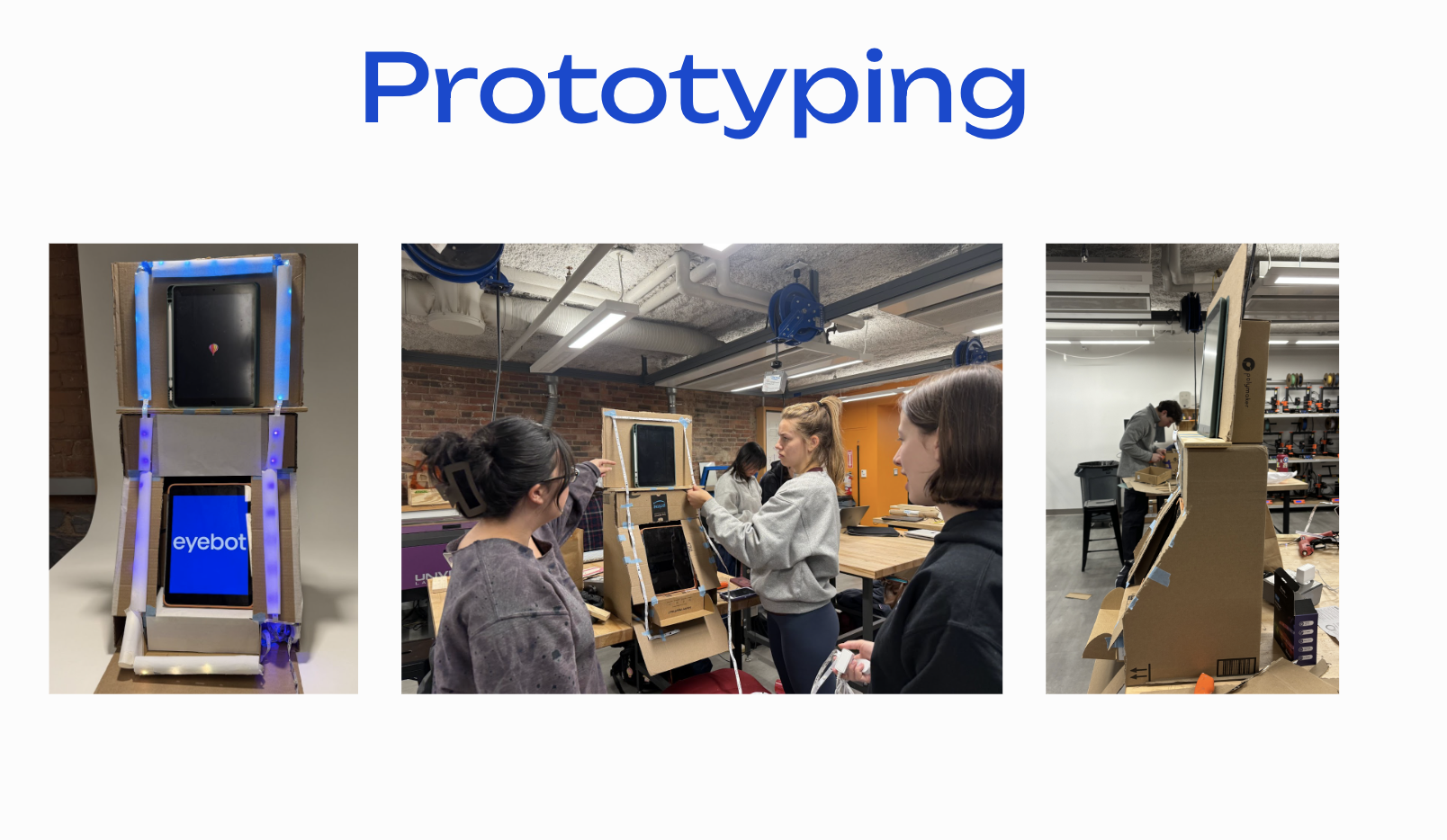
We iterated on our prototype through testing, recreating the Eyebot kiosk with added lighting and sound cues. Testing was conducted through Wizard-of-Oz-ing the prototype, with one team member taking notes, another switching lighting sections, the third playing sound cues, and the final member changing the replica eye scanning screen based on the tester’s interactions with the machine. We sought participants between the ages of 18-65, a mix of those wearing glasses and contacts, with varying prescriptions and native languages. Participants were randomly selected to test either a version with lighting and sounds, or a version without.
Our testing allowed us to collect data on
- The time it took to react to a screen-prompted action (ex: from “Place glasses here” to putting the glasses down with hands off)
- The time it took to look between screens (ex: looking from the main touchscreen to the upper eye scanning screen)
- The time it took to recover from errors; we forced two errors with the eye scanning failing, and with the glasses scan failing, and measured the time it took for users to figure out what to do next
From a total testing pool of 33 participants with our finalized prototype, we learned that while people could follow along with the workflow, they felt uncertain when switching their gaze and wanted more communication. Surprisingly, we found that people tended NOT to notice added lights and sounds and only the light change when prompting users to look at the top scan screen from the bottom touch screen had a statistically significant difference in reaction time. However, subjective feedback from several participants emphasized the value of added light and sound; at best, they helped people figure out what to do next, at worst, people did not notice them.
Based on our research and testing, we recommended to implement the light and sound into their next kiosk iteration, consider duration indicators on screens, add slightly more detail into instructions, and add a brief onboarding to familiarize users with the light and sound cues. In addition, further testing could be done with a more diverse user group, decibel sound ranges, “families” of similar sounds, and more accurate metric collection.
From presenting these to the head of design and mechanical engineering at Eyebot, we were able to provide support and preliminary testing of a multimodal kiosk, as well as additional suggestions garnering us reactions such as “I want to implement this right away!”
This project was truly an amazing way to wrap up my undergraduate time in the human factors engineering program in a creative way. Although light and sound design were relatively new concepts for me and my team, we were able to translate prior experiences in user interface design principles and testing to develop our prototype and recommendations.

I will get back to you within three business days.